
Ever wondered how artists create powerful paintings that grab your... Show more
 English
 Irish
Irish Agricultural Science
 Mathematics
 Physics
Sign up to see the contentIt's free!
Access to all documents
Improve your grades
Join milions of students
By signing up you accept Terms of Service and Privacy Policy
Subjects
2
•
Updated 2 Mar 2026
•
Ever wondered how artists create powerful paintings that grab your... Show more
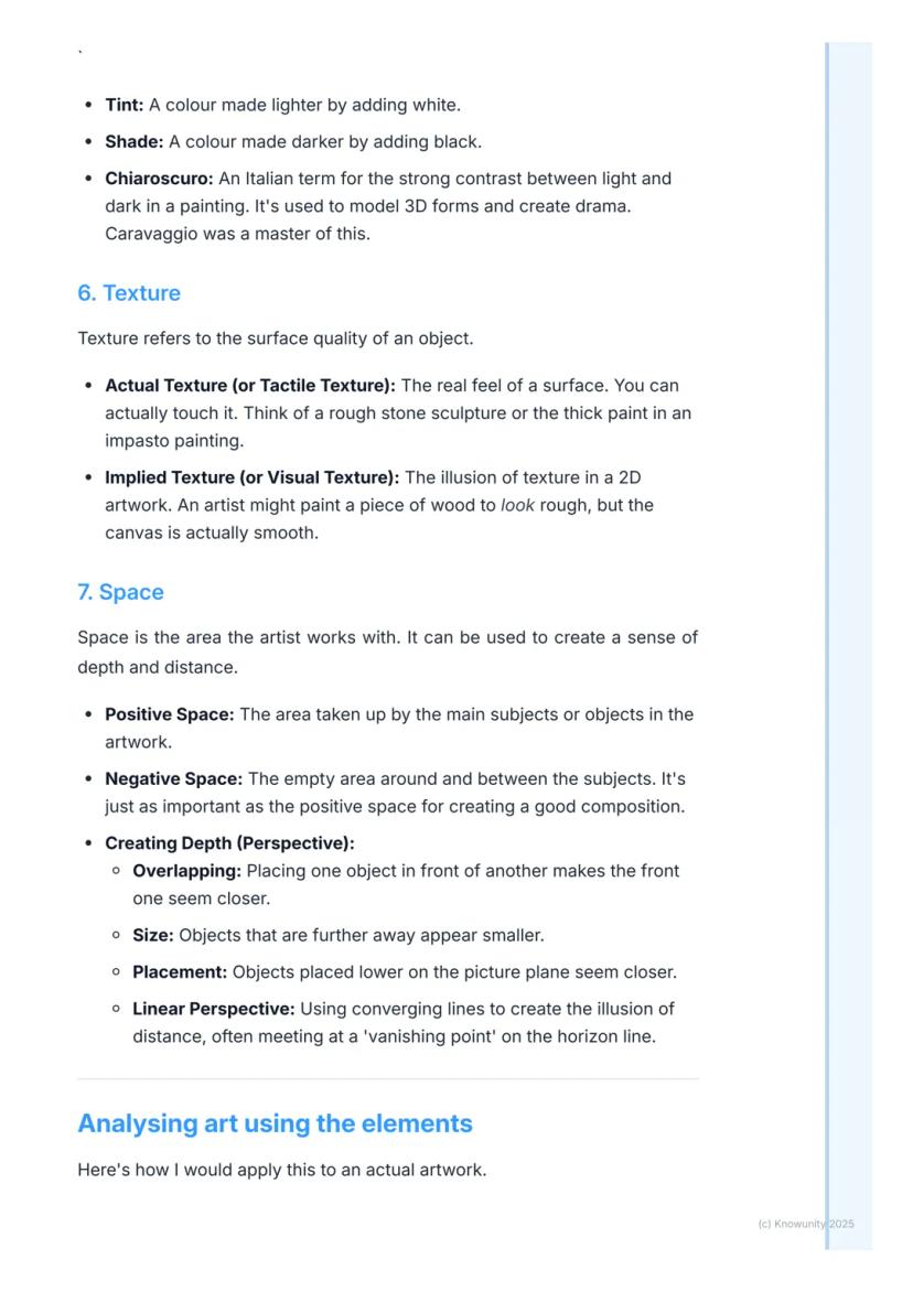
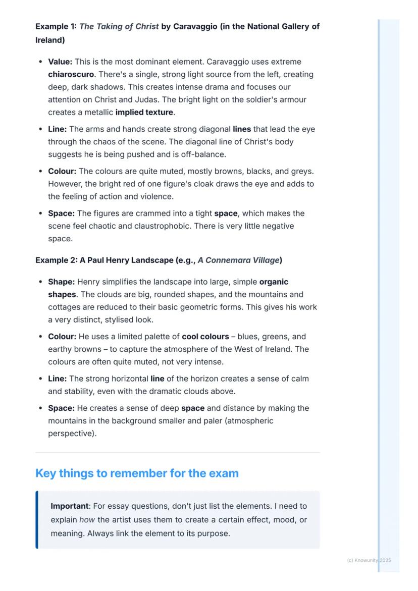
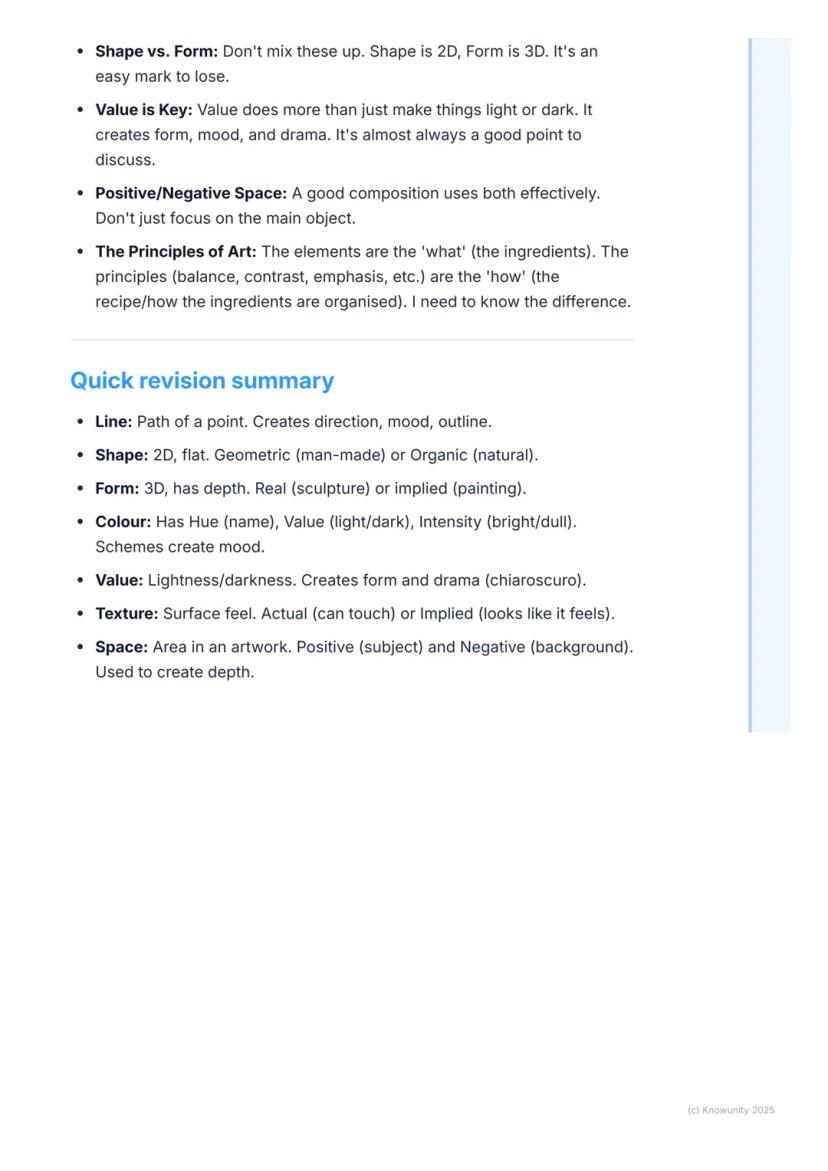
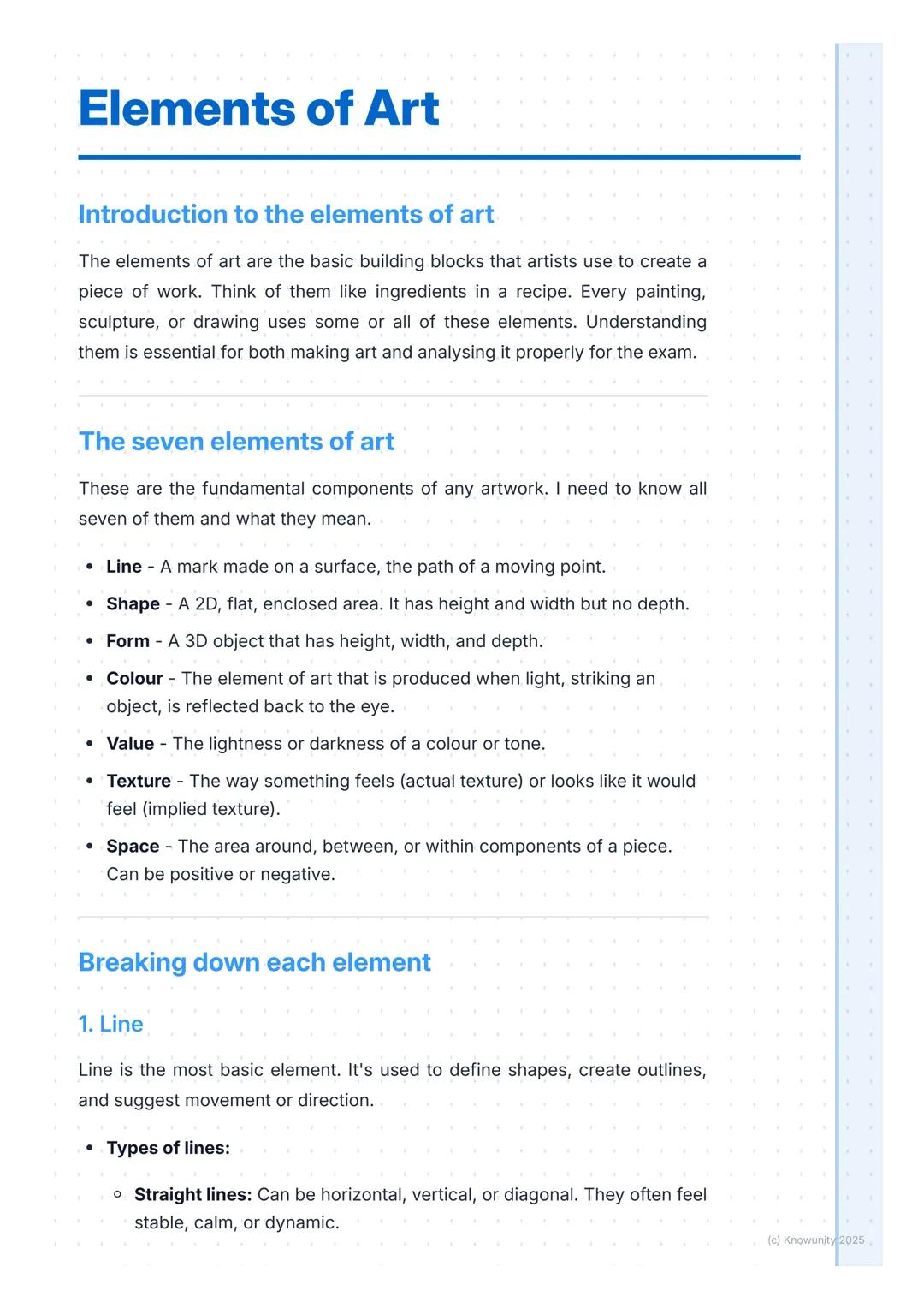
Think of the elements of art as your artistic toolkit - every painting, sculpture, or drawing you see uses these seven basic components. Whether you're creating your own artwork or analysing pieces for your Leaving Cert, understanding these elements is absolutely essential.
The seven elements are: line, shape, form, colour, value, texture, and space. Each one serves a specific purpose, and artists combine them cleverly to create mood, meaning, and visual impact.
Quick Tip: Don't just memorise these elements - focus on understanding how artists use them to create specific effects in their work.
Mastering these concepts will make you feel much more confident when tackling both practical art projects and written exams. You'll start seeing art in a completely new way once you understand what to look for.
Line is the most basic element - it's simply a mark made on a surface. But don't underestimate its power! Artists use different types of lines to create completely different feelings. Straight lines feel stable and calm, curved lines suggest gentle movement, whilst jagged lines create energy and tension.
Shape happens when a line encloses a space, creating a flat, 2D area. You'll encounter geometric shapes and organic shapes (irregular, natural forms like leaves or clouds).
Form takes things to the next level by adding depth - it's basically shape in 3D. Sculptures are obvious examples of actual form, but painters create the illusion of form using clever shading and perspective techniques.
Remember: Shape = 2D , Form = 3D . This distinction comes up frequently in exams!
The key difference is simple but crucial - you can walk around a form and see it from multiple angles, whilst a shape is completely flat.
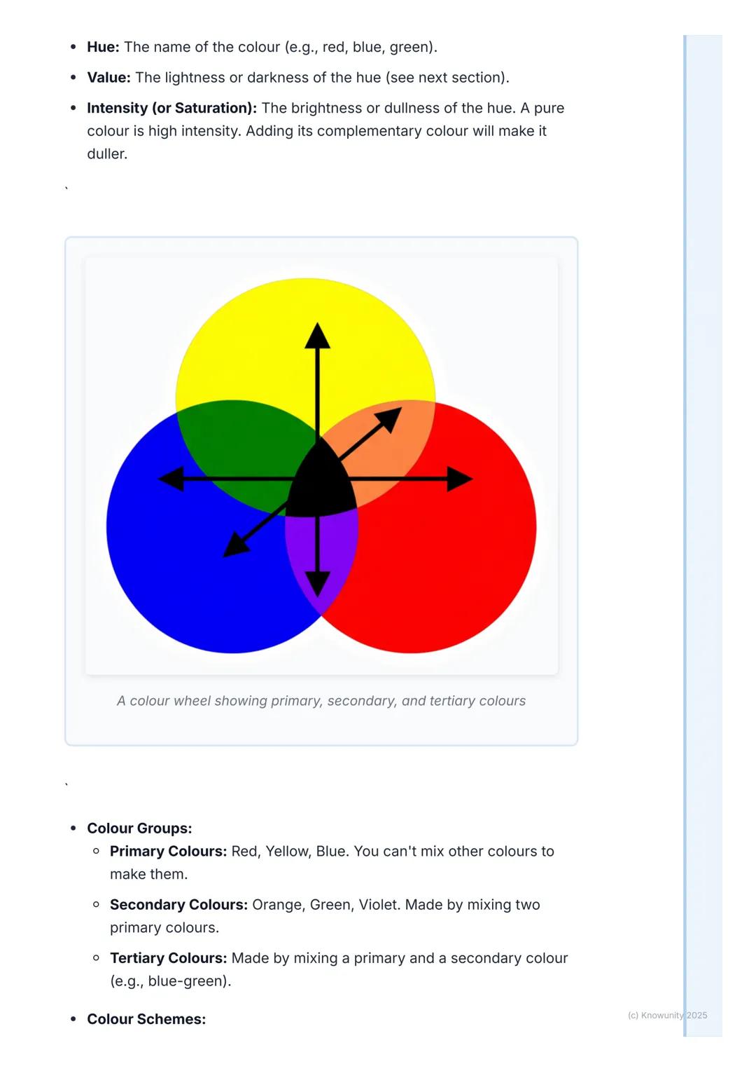
Colour is probably the most exciting element to work with, but it's also quite technical. Every colour has three main properties: hue (the actual colour name like "red"), value (how light or dark it is), and intensity (how bright or dull it appears).
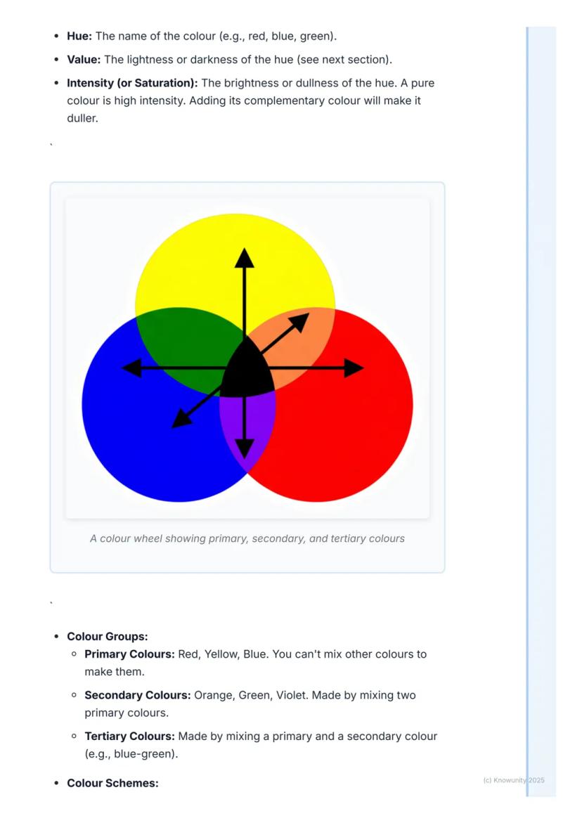
Understanding the colour wheel is essential. Primary colours (red, yellow, blue) can't be mixed from other colours, whilst secondary colours (orange, green, violet) come from mixing two primaries together.
Colour schemes create specific moods in artwork. Warm colours (reds, oranges, yellows) feel energetic and seem to jump forward, whilst cool colours (blues, greens, violets) feel peaceful and appear to recede. Complementary colours sit opposite each other on the colour wheel and create dramatic contrast.
Pro Tip: When analysing artwork, always consider why the artist chose specific colour schemes - they're never random choices!
Artists often use analogous colours (colours next to each other on the wheel) to create harmony and unity in their compositions.
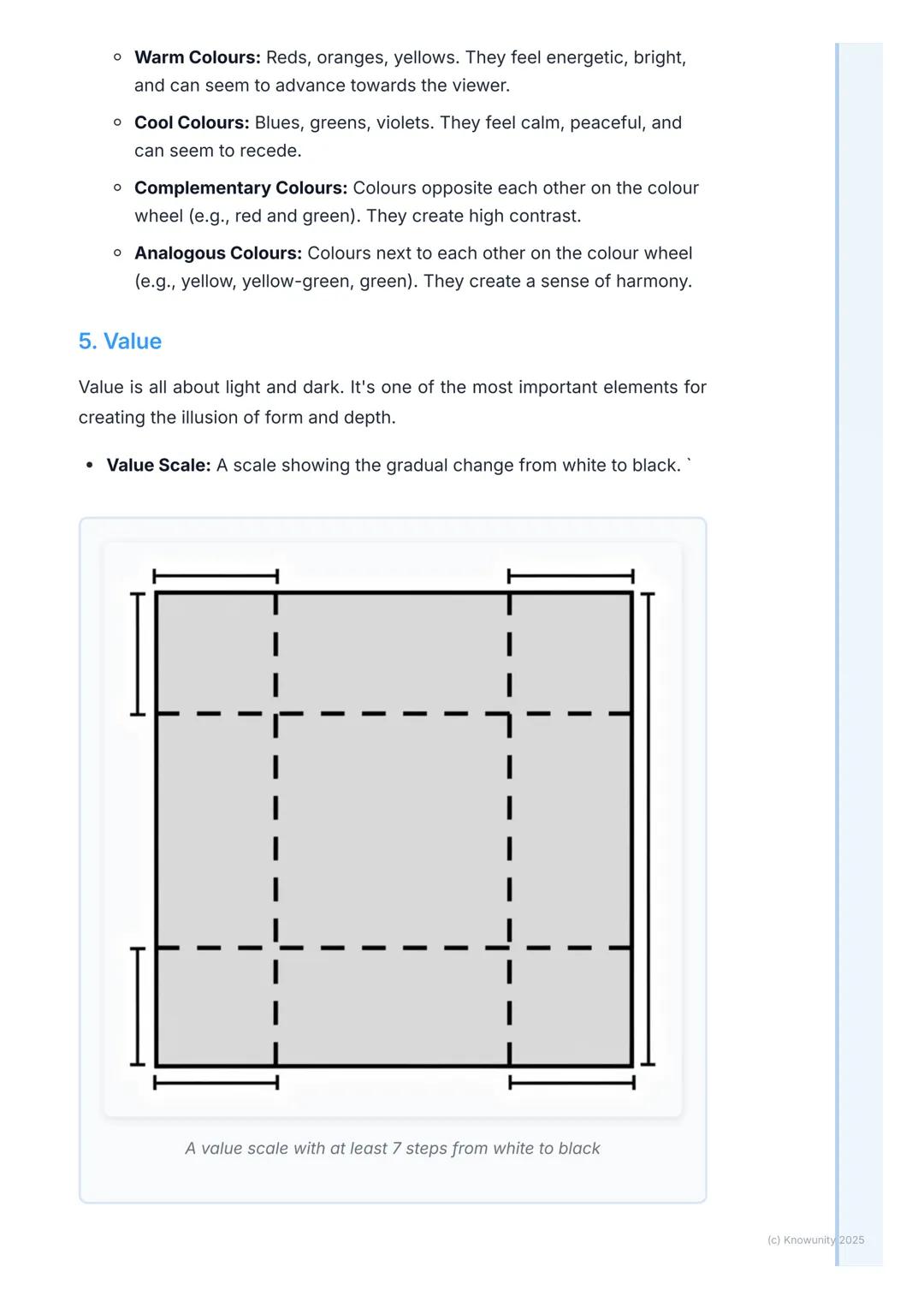
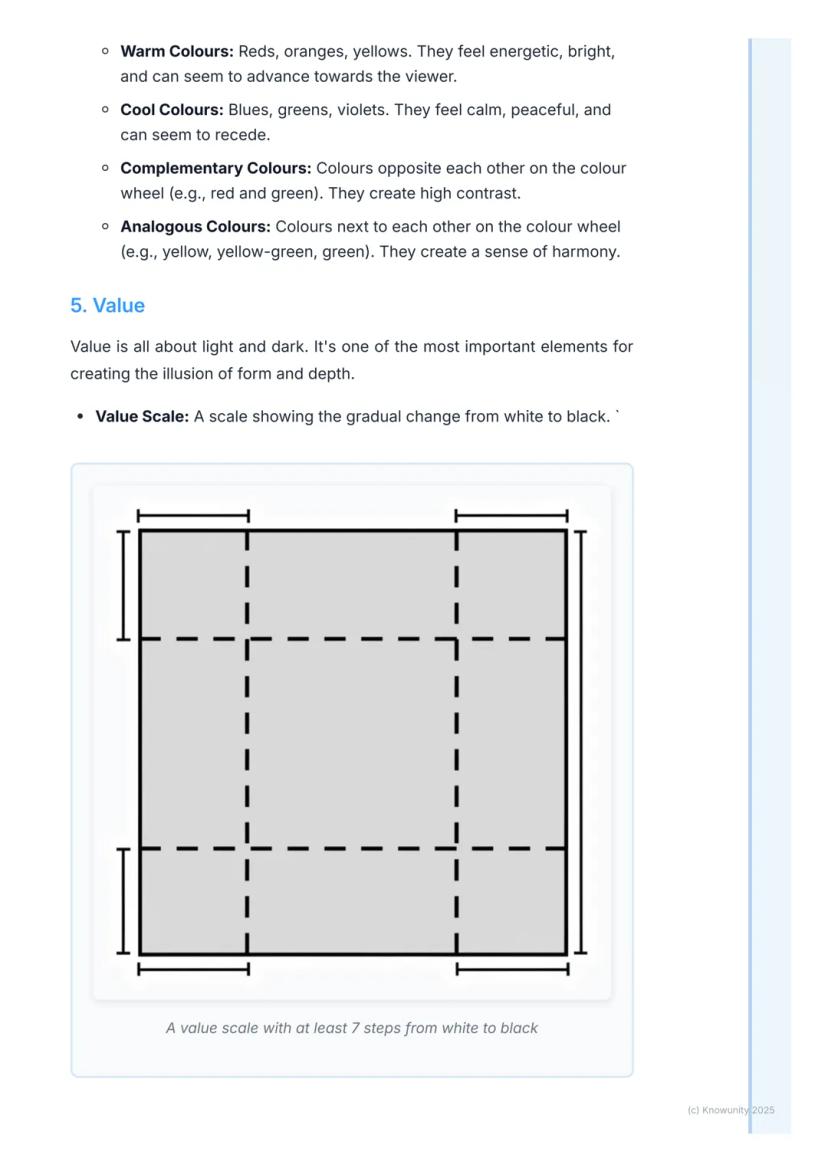
Value refers to how light or dark something appears, and it's honestly one of the most powerful tools artists have. You can create incredible drama and the illusion of 3D form using value alone - even without any colour at all.
A tint is a colour mixed with white (making it lighter), whilst a shade is a colour mixed with black (making it darker). Artists use these variations to model forms and create depth in their work.
Chiaroscuro is a fancy Italian term for dramatic contrasts between light and dark. Caravaggio was absolutely brilliant at this technique - his paintings feel like theatrical spotlights are illuminating the subjects whilst everything else disappears into shadow.
Exam Gold: Value discussions almost always earn good marks because this element does so much heavy lifting in creating mood, form, and focus.
Learning to see value relationships will transform how you understand and create art. It's the secret ingredient that makes flat drawings look three-dimensional.
Texture is all about surface quality - how something feels or appears it would feel. Actual texture exists in real life (think of Van Gogh's thick, bumpy paint), whilst implied texture is the clever illusion of texture in flat paintings.
Space might seem simple, but it's incredibly sophisticated. Positive space contains your main subjects, whilst negative space is the "empty" area around them. Both are equally important for creating strong compositions.
Artists create the illusion of depth using several tricks: overlapping objects, making distant things smaller, placing closer objects lower on the canvas, and using linear perspective with converging lines that meet at a vanishing point.
Think About It: Negative space isn't actually empty - it's working just as hard as positive space to create balance and focus.
Understanding spatial relationships will help you create more convincing artwork and better analyse how professional artists guide your eye through their compositions.
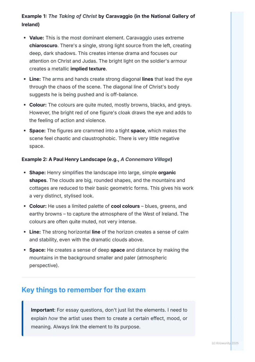
Let's see these elements in action with Caravaggio's "The Taking of Christ" (which you can see in Dublin's National Gallery). Value dominates this painting - the dramatic chiaroscuro creates intense emotional impact through stark light and shadow contrasts.
The diagonal lines of arms and Christ's falling body create movement and chaos, whilst the cramped space with minimal negative area makes everything feel claustrophobic and urgent. The mostly muted colours with one bright red cloak add to the violence and drama.
Paul Henry's Irish landscapes work completely differently. He simplifies natural forms into large organic shapes, uses cool colour palettes to capture Ireland's atmosphere, and employs strong horizontal lines to create peaceful stability.
Exam Success: Never just list elements - always explain how the artist uses them to create specific effects, moods, or meanings.
Henry creates depth through atmospheric perspective, making distant mountains smaller and paler to suggest vast Irish landscapes stretching into the distance.
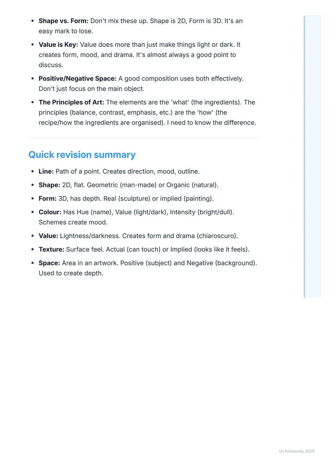
Here's your rapid-fire revision list: Line creates direction and mood; Shape (2D) can be geometric or organic; Form (3D) has actual depth; Colour has hue, value, and intensity; Value creates drama through light/dark; Texture is surface quality; Space includes both positive and negative areas.
Don't confuse elements of art (the ingredients) with principles of art (how the ingredients are organised). This distinction frequently trips students up in exams, but you've got this sorted now.
Value discussions are almost always worth including because this element works so hard - it creates form, mood, drama, and focus all at once. It's your secret weapon for earning marks.
Confidence Booster: You now understand the fundamental language of art - these seven elements appear in every single artwork ever created!
Remember that effective compositions use both positive and negative space thoughtfully. Great artists know that the "empty" areas are just as important as the main subjects for creating balance and visual impact.
Our AI companion is specifically built for the needs of students. Based on the millions of content pieces we have on the platform we can provide truly meaningful and relevant answers to students. But its not only about answers, the companion is even more about guiding students through their daily learning challenges, with personalised study plans, quizzes or content pieces in the chat and 100% personalisation based on the students skills and developments.
You can download the app in the Google Play Store and in the Apple App Store.
That's right! Enjoy free access to study content, connect with fellow students, and get instant help – all at your fingertips.
App Store
Google Play
The app is very easy to use and well designed. I have found everything I was looking for so far and have been able to learn a lot from the presentations! I will definitely use the app for a class assignment! And of course it also helps a lot as an inspiration.
Stefan S
iOS user
This app is really great. There are so many study notes and help [...]. My problem subject is French, for example, and the app has so many options for help. Thanks to this app, I have improved my French. I would recommend it to anyone.
Samantha Klich
Android user
Wow, I am really amazed. I just tried the app because I've seen it advertised many times and was absolutely stunned. This app is THE HELP you want for school and above all, it offers so many things, such as workouts and fact sheets, which have been VERY helpful to me personally.
Anna
iOS user
I think it’s very much worth it and you’ll end up using it a lot once you get the hang of it and even after looking at others notes you can still ask your Artificial intelligence buddy the question and ask to simplify it if you still don’t get it!!! In the end I think it’s worth it 😊👍 ⚠️Also DID I MENTION ITS FREEE YOU DON’T HAVE TO PAY FOR ANYTHING AND STILL GET YOUR GRADES IN PERFECTLY❗️❗️⚠️
Thomas R
iOS user
Knowunity is the BEST app I’ve used in a minute. This is not an ai review or anything this is genuinely coming from a 7th grade student (I know 2011 im young) but dude this app is a 10/10 i have maintained a 3.8 gpa and have plenty of time for gaming. I love it and my mom is just happy I got good grades
Brad T
Android user
Not only did it help me find the answer but it also showed me alternative ways to solve it. I was horrible in math and science but now I have an a in both subjects. Thanks for the help🤍🤍
David K
iOS user
The app's just great! All I have to do is enter the topic in the search bar and I get the response real fast. I don't have to watch 10 YouTube videos to understand something, so I'm saving my time. Highly recommended!
Sudenaz Ocak
Android user
In school I was really bad at maths but thanks to the app, I am doing better now. I am so grateful that you made the app.
Greenlight Bonnie
Android user
I found this app a couple years ago and it has only gotten better since then. I really love it because it can help with written questions and photo questions. Also, it can find study guides that other people have made as well as flashcard sets and practice tests. The free version is also amazing for students who might not be able to afford it. Would 100% recommend
Aubrey
iOS user
Best app if you're in Highschool or Junior high. I have been using this app for 2 school years and it's the best, it's good if you don't have anyone to help you with school work.😋🩷🎀
Marco B
iOS user
THE QUIZES AND FLASHCARDS ARE SO USEFUL AND I LOVE Knowunity AI. IT ALSO IS LITREALLY LIKE CHATGPT BUT SMARTER!! HELPED ME WITH MY MASCARA PROBLEMS TOO!! AS WELL AS MY REAL SUBJECTS ! DUHHH 😍😁😲🤑💗✨🎀😮
Elisha
iOS user
This app is phenomenal down to the correct info and the various topics you can study! I greatly recommend it for people who struggle with procrastination and those who need homework help. It has been perfectly accurate for world 1 history as far as I’ve seen! Geometry too!
Paul T
iOS user
The app is very easy to use and well designed. I have found everything I was looking for so far and have been able to learn a lot from the presentations! I will definitely use the app for a class assignment! And of course it also helps a lot as an inspiration.
Stefan S
iOS user
This app is really great. There are so many study notes and help [...]. My problem subject is French, for example, and the app has so many options for help. Thanks to this app, I have improved my French. I would recommend it to anyone.
Samantha Klich
Android user
Wow, I am really amazed. I just tried the app because I've seen it advertised many times and was absolutely stunned. This app is THE HELP you want for school and above all, it offers so many things, such as workouts and fact sheets, which have been VERY helpful to me personally.
Anna
iOS user
I think it’s very much worth it and you’ll end up using it a lot once you get the hang of it and even after looking at others notes you can still ask your Artificial intelligence buddy the question and ask to simplify it if you still don’t get it!!! In the end I think it’s worth it 😊👍 ⚠️Also DID I MENTION ITS FREEE YOU DON’T HAVE TO PAY FOR ANYTHING AND STILL GET YOUR GRADES IN PERFECTLY❗️❗️⚠️
Thomas R
iOS user
Knowunity is the BEST app I’ve used in a minute. This is not an ai review or anything this is genuinely coming from a 7th grade student (I know 2011 im young) but dude this app is a 10/10 i have maintained a 3.8 gpa and have plenty of time for gaming. I love it and my mom is just happy I got good grades
Brad T
Android user
Not only did it help me find the answer but it also showed me alternative ways to solve it. I was horrible in math and science but now I have an a in both subjects. Thanks for the help🤍🤍
David K
iOS user
The app's just great! All I have to do is enter the topic in the search bar and I get the response real fast. I don't have to watch 10 YouTube videos to understand something, so I'm saving my time. Highly recommended!
Sudenaz Ocak
Android user
In school I was really bad at maths but thanks to the app, I am doing better now. I am so grateful that you made the app.
Greenlight Bonnie
Android user
I found this app a couple years ago and it has only gotten better since then. I really love it because it can help with written questions and photo questions. Also, it can find study guides that other people have made as well as flashcard sets and practice tests. The free version is also amazing for students who might not be able to afford it. Would 100% recommend
Aubrey
iOS user
Best app if you're in Highschool or Junior high. I have been using this app for 2 school years and it's the best, it's good if you don't have anyone to help you with school work.😋🩷🎀
Marco B
iOS user
THE QUIZES AND FLASHCARDS ARE SO USEFUL AND I LOVE Knowunity AI. IT ALSO IS LITREALLY LIKE CHATGPT BUT SMARTER!! HELPED ME WITH MY MASCARA PROBLEMS TOO!! AS WELL AS MY REAL SUBJECTS ! DUHHH 😍😁😲🤑💗✨🎀😮
Elisha
iOS user
This app is phenomenal down to the correct info and the various topics you can study! I greatly recommend it for people who struggle with procrastination and those who need homework help. It has been perfectly accurate for world 1 history as far as I’ve seen! Geometry too!
Paul T
iOS user
Ever wondered how artists create powerful paintings that grab your attention or sculptures that seem to come alive? It all comes down to mastering seven fundamental building blocks called the elements of art. These are like the ingredients in a... Show more
Access to all documents
Improve your grades
Join milions of students
By signing up you accept Terms of Service and Privacy Policy
Think of the elements of art as your artistic toolkit - every painting, sculpture, or drawing you see uses these seven basic components. Whether you're creating your own artwork or analysing pieces for your Leaving Cert, understanding these elements is absolutely essential.
The seven elements are: line, shape, form, colour, value, texture, and space. Each one serves a specific purpose, and artists combine them cleverly to create mood, meaning, and visual impact.
Quick Tip: Don't just memorise these elements - focus on understanding how artists use them to create specific effects in their work.
Mastering these concepts will make you feel much more confident when tackling both practical art projects and written exams. You'll start seeing art in a completely new way once you understand what to look for.
Access to all documents
Improve your grades
Join milions of students
By signing up you accept Terms of Service and Privacy Policy
Line is the most basic element - it's simply a mark made on a surface. But don't underestimate its power! Artists use different types of lines to create completely different feelings. Straight lines feel stable and calm, curved lines suggest gentle movement, whilst jagged lines create energy and tension.
Shape happens when a line encloses a space, creating a flat, 2D area. You'll encounter geometric shapes and organic shapes (irregular, natural forms like leaves or clouds).
Form takes things to the next level by adding depth - it's basically shape in 3D. Sculptures are obvious examples of actual form, but painters create the illusion of form using clever shading and perspective techniques.
Remember: Shape = 2D , Form = 3D . This distinction comes up frequently in exams!
The key difference is simple but crucial - you can walk around a form and see it from multiple angles, whilst a shape is completely flat.
Access to all documents
Improve your grades
Join milions of students
By signing up you accept Terms of Service and Privacy Policy
Colour is probably the most exciting element to work with, but it's also quite technical. Every colour has three main properties: hue (the actual colour name like "red"), value (how light or dark it is), and intensity (how bright or dull it appears).
Understanding the colour wheel is essential. Primary colours (red, yellow, blue) can't be mixed from other colours, whilst secondary colours (orange, green, violet) come from mixing two primaries together.
Colour schemes create specific moods in artwork. Warm colours (reds, oranges, yellows) feel energetic and seem to jump forward, whilst cool colours (blues, greens, violets) feel peaceful and appear to recede. Complementary colours sit opposite each other on the colour wheel and create dramatic contrast.
Pro Tip: When analysing artwork, always consider why the artist chose specific colour schemes - they're never random choices!
Artists often use analogous colours (colours next to each other on the wheel) to create harmony and unity in their compositions.
Access to all documents
Improve your grades
Join milions of students
By signing up you accept Terms of Service and Privacy Policy
Value refers to how light or dark something appears, and it's honestly one of the most powerful tools artists have. You can create incredible drama and the illusion of 3D form using value alone - even without any colour at all.
A tint is a colour mixed with white (making it lighter), whilst a shade is a colour mixed with black (making it darker). Artists use these variations to model forms and create depth in their work.
Chiaroscuro is a fancy Italian term for dramatic contrasts between light and dark. Caravaggio was absolutely brilliant at this technique - his paintings feel like theatrical spotlights are illuminating the subjects whilst everything else disappears into shadow.
Exam Gold: Value discussions almost always earn good marks because this element does so much heavy lifting in creating mood, form, and focus.
Learning to see value relationships will transform how you understand and create art. It's the secret ingredient that makes flat drawings look three-dimensional.
Access to all documents
Improve your grades
Join milions of students
By signing up you accept Terms of Service and Privacy Policy
Texture is all about surface quality - how something feels or appears it would feel. Actual texture exists in real life (think of Van Gogh's thick, bumpy paint), whilst implied texture is the clever illusion of texture in flat paintings.
Space might seem simple, but it's incredibly sophisticated. Positive space contains your main subjects, whilst negative space is the "empty" area around them. Both are equally important for creating strong compositions.
Artists create the illusion of depth using several tricks: overlapping objects, making distant things smaller, placing closer objects lower on the canvas, and using linear perspective with converging lines that meet at a vanishing point.
Think About It: Negative space isn't actually empty - it's working just as hard as positive space to create balance and focus.
Understanding spatial relationships will help you create more convincing artwork and better analyse how professional artists guide your eye through their compositions.
Access to all documents
Improve your grades
Join milions of students
By signing up you accept Terms of Service and Privacy Policy
Let's see these elements in action with Caravaggio's "The Taking of Christ" (which you can see in Dublin's National Gallery). Value dominates this painting - the dramatic chiaroscuro creates intense emotional impact through stark light and shadow contrasts.
The diagonal lines of arms and Christ's falling body create movement and chaos, whilst the cramped space with minimal negative area makes everything feel claustrophobic and urgent. The mostly muted colours with one bright red cloak add to the violence and drama.
Paul Henry's Irish landscapes work completely differently. He simplifies natural forms into large organic shapes, uses cool colour palettes to capture Ireland's atmosphere, and employs strong horizontal lines to create peaceful stability.
Exam Success: Never just list elements - always explain how the artist uses them to create specific effects, moods, or meanings.
Henry creates depth through atmospheric perspective, making distant mountains smaller and paler to suggest vast Irish landscapes stretching into the distance.
Access to all documents
Improve your grades
Join milions of students
By signing up you accept Terms of Service and Privacy Policy
Here's your rapid-fire revision list: Line creates direction and mood; Shape (2D) can be geometric or organic; Form (3D) has actual depth; Colour has hue, value, and intensity; Value creates drama through light/dark; Texture is surface quality; Space includes both positive and negative areas.
Don't confuse elements of art (the ingredients) with principles of art (how the ingredients are organised). This distinction frequently trips students up in exams, but you've got this sorted now.
Value discussions are almost always worth including because this element works so hard - it creates form, mood, drama, and focus all at once. It's your secret weapon for earning marks.
Confidence Booster: You now understand the fundamental language of art - these seven elements appear in every single artwork ever created!
Remember that effective compositions use both positive and negative space thoughtfully. Great artists know that the "empty" areas are just as important as the main subjects for creating balance and visual impact.
Our AI companion is specifically built for the needs of students. Based on the millions of content pieces we have on the platform we can provide truly meaningful and relevant answers to students. But its not only about answers, the companion is even more about guiding students through their daily learning challenges, with personalised study plans, quizzes or content pieces in the chat and 100% personalisation based on the students skills and developments.
You can download the app in the Google Play Store and in the Apple App Store.
That's right! Enjoy free access to study content, connect with fellow students, and get instant help – all at your fingertips.
0
Smart Tools NEW
Transform this note into: ✓ 50+ Practice Questions ✓ Interactive Flashcards ✓ Full Practice Test ✓ Essay Outlines
App Store
Google Play
The app is very easy to use and well designed. I have found everything I was looking for so far and have been able to learn a lot from the presentations! I will definitely use the app for a class assignment! And of course it also helps a lot as an inspiration.
Stefan S
iOS user
This app is really great. There are so many study notes and help [...]. My problem subject is French, for example, and the app has so many options for help. Thanks to this app, I have improved my French. I would recommend it to anyone.
Samantha Klich
Android user
Wow, I am really amazed. I just tried the app because I've seen it advertised many times and was absolutely stunned. This app is THE HELP you want for school and above all, it offers so many things, such as workouts and fact sheets, which have been VERY helpful to me personally.
Anna
iOS user
I think it’s very much worth it and you’ll end up using it a lot once you get the hang of it and even after looking at others notes you can still ask your Artificial intelligence buddy the question and ask to simplify it if you still don’t get it!!! In the end I think it’s worth it 😊👍 ⚠️Also DID I MENTION ITS FREEE YOU DON’T HAVE TO PAY FOR ANYTHING AND STILL GET YOUR GRADES IN PERFECTLY❗️❗️⚠️
Thomas R
iOS user
Knowunity is the BEST app I’ve used in a minute. This is not an ai review or anything this is genuinely coming from a 7th grade student (I know 2011 im young) but dude this app is a 10/10 i have maintained a 3.8 gpa and have plenty of time for gaming. I love it and my mom is just happy I got good grades
Brad T
Android user
Not only did it help me find the answer but it also showed me alternative ways to solve it. I was horrible in math and science but now I have an a in both subjects. Thanks for the help🤍🤍
David K
iOS user
The app's just great! All I have to do is enter the topic in the search bar and I get the response real fast. I don't have to watch 10 YouTube videos to understand something, so I'm saving my time. Highly recommended!
Sudenaz Ocak
Android user
In school I was really bad at maths but thanks to the app, I am doing better now. I am so grateful that you made the app.
Greenlight Bonnie
Android user
I found this app a couple years ago and it has only gotten better since then. I really love it because it can help with written questions and photo questions. Also, it can find study guides that other people have made as well as flashcard sets and practice tests. The free version is also amazing for students who might not be able to afford it. Would 100% recommend
Aubrey
iOS user
Best app if you're in Highschool or Junior high. I have been using this app for 2 school years and it's the best, it's good if you don't have anyone to help you with school work.😋🩷🎀
Marco B
iOS user
THE QUIZES AND FLASHCARDS ARE SO USEFUL AND I LOVE Knowunity AI. IT ALSO IS LITREALLY LIKE CHATGPT BUT SMARTER!! HELPED ME WITH MY MASCARA PROBLEMS TOO!! AS WELL AS MY REAL SUBJECTS ! DUHHH 😍😁😲🤑💗✨🎀😮
Elisha
iOS user
This app is phenomenal down to the correct info and the various topics you can study! I greatly recommend it for people who struggle with procrastination and those who need homework help. It has been perfectly accurate for world 1 history as far as I’ve seen! Geometry too!
Paul T
iOS user
The app is very easy to use and well designed. I have found everything I was looking for so far and have been able to learn a lot from the presentations! I will definitely use the app for a class assignment! And of course it also helps a lot as an inspiration.
Stefan S
iOS user
This app is really great. There are so many study notes and help [...]. My problem subject is French, for example, and the app has so many options for help. Thanks to this app, I have improved my French. I would recommend it to anyone.
Samantha Klich
Android user
Wow, I am really amazed. I just tried the app because I've seen it advertised many times and was absolutely stunned. This app is THE HELP you want for school and above all, it offers so many things, such as workouts and fact sheets, which have been VERY helpful to me personally.
Anna
iOS user
I think it’s very much worth it and you’ll end up using it a lot once you get the hang of it and even after looking at others notes you can still ask your Artificial intelligence buddy the question and ask to simplify it if you still don’t get it!!! In the end I think it’s worth it 😊👍 ⚠️Also DID I MENTION ITS FREEE YOU DON’T HAVE TO PAY FOR ANYTHING AND STILL GET YOUR GRADES IN PERFECTLY❗️❗️⚠️
Thomas R
iOS user
Knowunity is the BEST app I’ve used in a minute. This is not an ai review or anything this is genuinely coming from a 7th grade student (I know 2011 im young) but dude this app is a 10/10 i have maintained a 3.8 gpa and have plenty of time for gaming. I love it and my mom is just happy I got good grades
Brad T
Android user
Not only did it help me find the answer but it also showed me alternative ways to solve it. I was horrible in math and science but now I have an a in both subjects. Thanks for the help🤍🤍
David K
iOS user
The app's just great! All I have to do is enter the topic in the search bar and I get the response real fast. I don't have to watch 10 YouTube videos to understand something, so I'm saving my time. Highly recommended!
Sudenaz Ocak
Android user
In school I was really bad at maths but thanks to the app, I am doing better now. I am so grateful that you made the app.
Greenlight Bonnie
Android user
I found this app a couple years ago and it has only gotten better since then. I really love it because it can help with written questions and photo questions. Also, it can find study guides that other people have made as well as flashcard sets and practice tests. The free version is also amazing for students who might not be able to afford it. Would 100% recommend
Aubrey
iOS user
Best app if you're in Highschool or Junior high. I have been using this app for 2 school years and it's the best, it's good if you don't have anyone to help you with school work.😋🩷🎀
Marco B
iOS user
THE QUIZES AND FLASHCARDS ARE SO USEFUL AND I LOVE Knowunity AI. IT ALSO IS LITREALLY LIKE CHATGPT BUT SMARTER!! HELPED ME WITH MY MASCARA PROBLEMS TOO!! AS WELL AS MY REAL SUBJECTS ! DUHHH 😍😁😲🤑💗✨🎀😮
Elisha
iOS user
This app is phenomenal down to the correct info and the various topics you can study! I greatly recommend it for people who struggle with procrastination and those who need homework help. It has been perfectly accurate for world 1 history as far as I’ve seen! Geometry too!
Paul T
iOS user